The Card domain, as part of the Payoneer platform, offers both physical and virtual options to customers across 150+ countries. It enables seamless payments for online advertising on platforms such as Facebook, Amazon, and Google. Additionally, customers can use the card for online transactions, including payments to suppliers, contractors, and other business-related expenses.
COMPANY Payoneer
MY ROLE Lead product designer
TOOLS Figma, Miro, Illustrator, Maze
SKILLS Research analysis, workshopping, UI/UX design, usability testing
The Problem
Based on multiple user observation sessions (shadowing) across various regions and in-depth user interviews with 6 customers, the following problems areas have been identified.
Customers rely on their CSM to complete daily and weekly tasks.
Navigating the card list and finding specific card details or actions is challenging.
Lack of understanding of the structure of the cards (Primary VS Linked)
Managing and controlling spending on each card is difficult.
Tracking card balances and transactions is not intuitive.
Accessing information and completing actions on the go is inconvenient.
Card actions are hard to find among other payment methods.
There is a lack of clarity regarding fees
The system’s current architecture lacks flexibility, limiting scalability and restricting the addition of new features and settings.
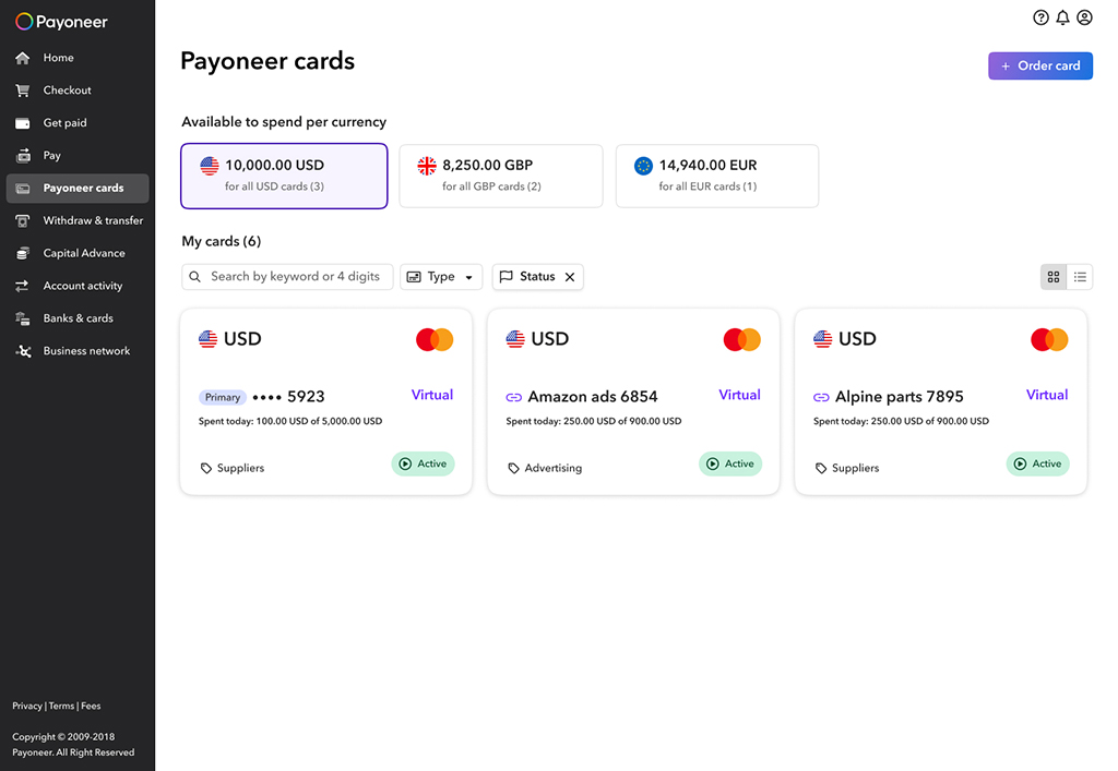
Old design
The solutions (TL;DR)
CX/UX
Make self-service activity clear and visible
Track users card transactions
Understand the value of cards
Understand what fees they are paying and why
Simplify the path to cards without reducing other products awareness
Differentiate companies (supplementary card holder) experience from individuals
Create a clear way to view many cards (Table VS Cards view)
Add batch actions for the cards
Increase clarity and visibility around available card balance vs. card spend
Allow users to manage and personalize their cards experience
UI
Align the look and feel to the new design system
Redesign of the Payoneer card and full aligning with the guidelines of the Mastercard.
Create a clear and friendly environment
Usability also encompasses accessibility. All components meet at least the WCAG (AA) standard
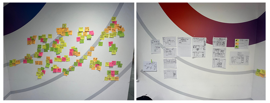
The workshop
Research and competitors review
Collaborative design session and ideation
Creating persona
Creating wireframes
Stakeholder validation
Upfront challenges
Dashboard: Cards view VS Table view
Cards structure representation, layout and navigation
Card page VS Right pan
Designing a credit card that adheres to Mastercard’s standards and strict guidelines. This includes maintaining proper card dimensions, typography, security features, branding placement, and accessibility considerations.
Filters and Funds available on the card
Main actions on the card, manage limits, nicknames, MCC, sorting
Prototyping and User Testing
Unmoderated test. Maze participants. 20 participants per test. Countries: Israel, Chile, UK, Poland Age: 25-65 Profession: Engineer, Professor, Digital nomads, Freelancer, Computer software, Retailers, Financial experts, Salesman, Product manager, marketing consultant, Worker in biotech industry, Small business owner.
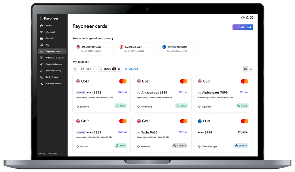
Final UI
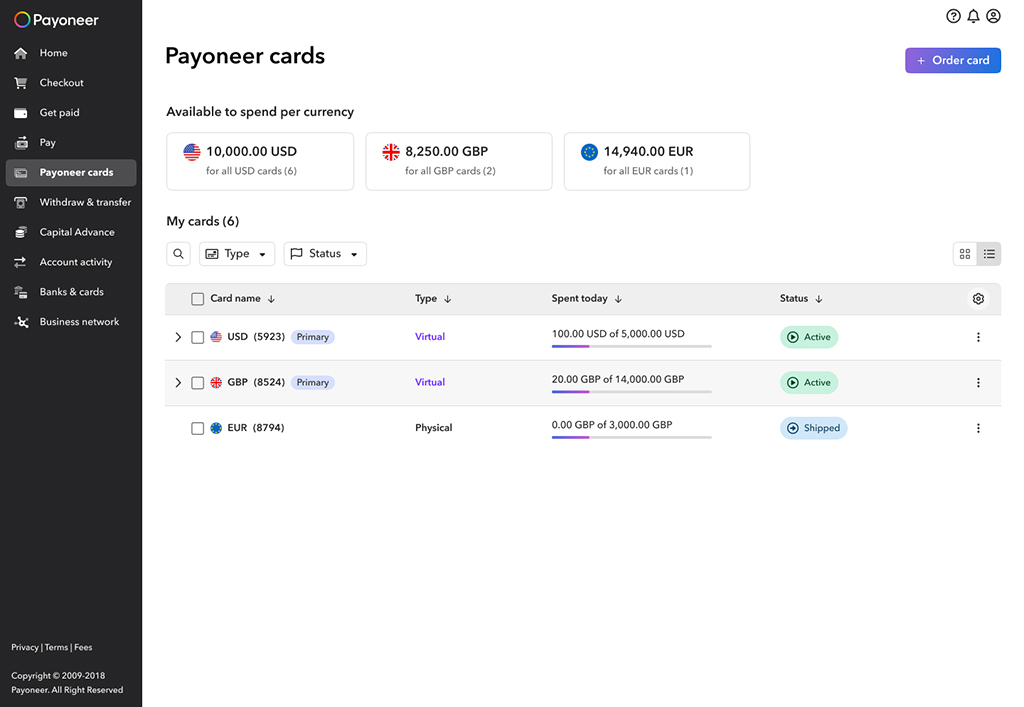
Dashboard. Working with filters: The component displaying “Available on Cards” not only provides a clear view of the user’s card balance but also functions as a filter for easier fund management. The search field, essential for users managing multiple cards, expands to the right for better accessibility.
Table View: Primary cards with linked cards are grouped and collapsed for a more streamlined display.
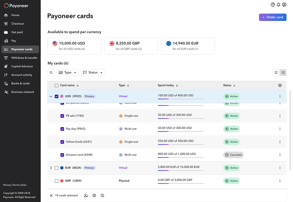
Table View: The expanded component of the Primary Card includes bulk action capabilities, allowing users to efficiently manage multiple cards at once.
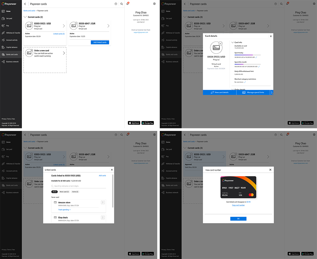
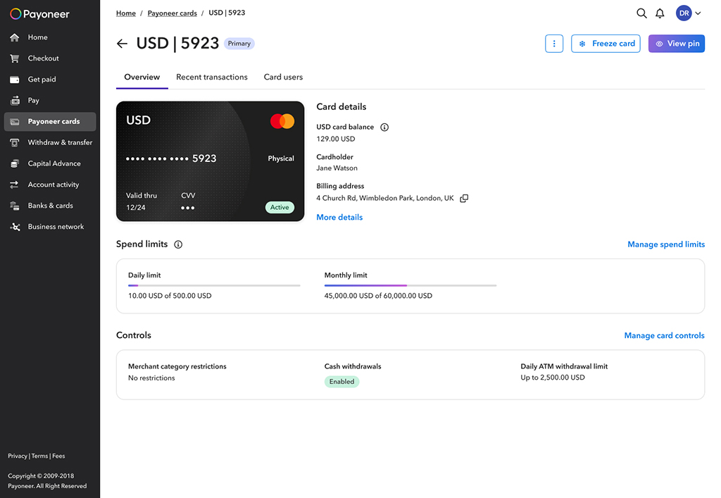
Physical card page.
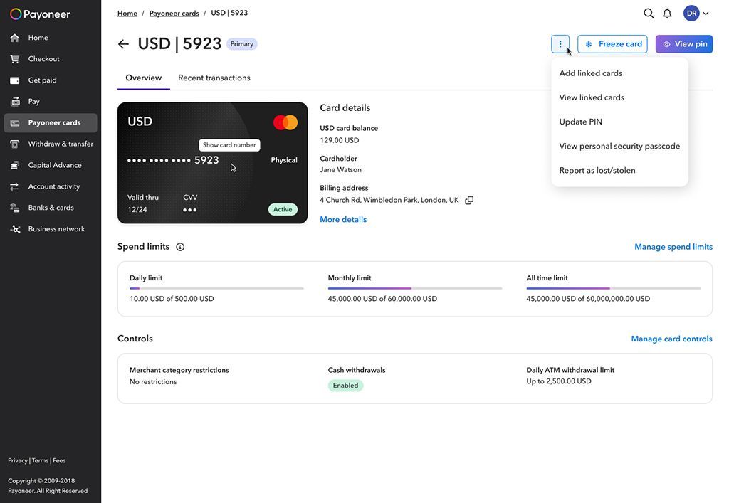
Physical card page: actions.
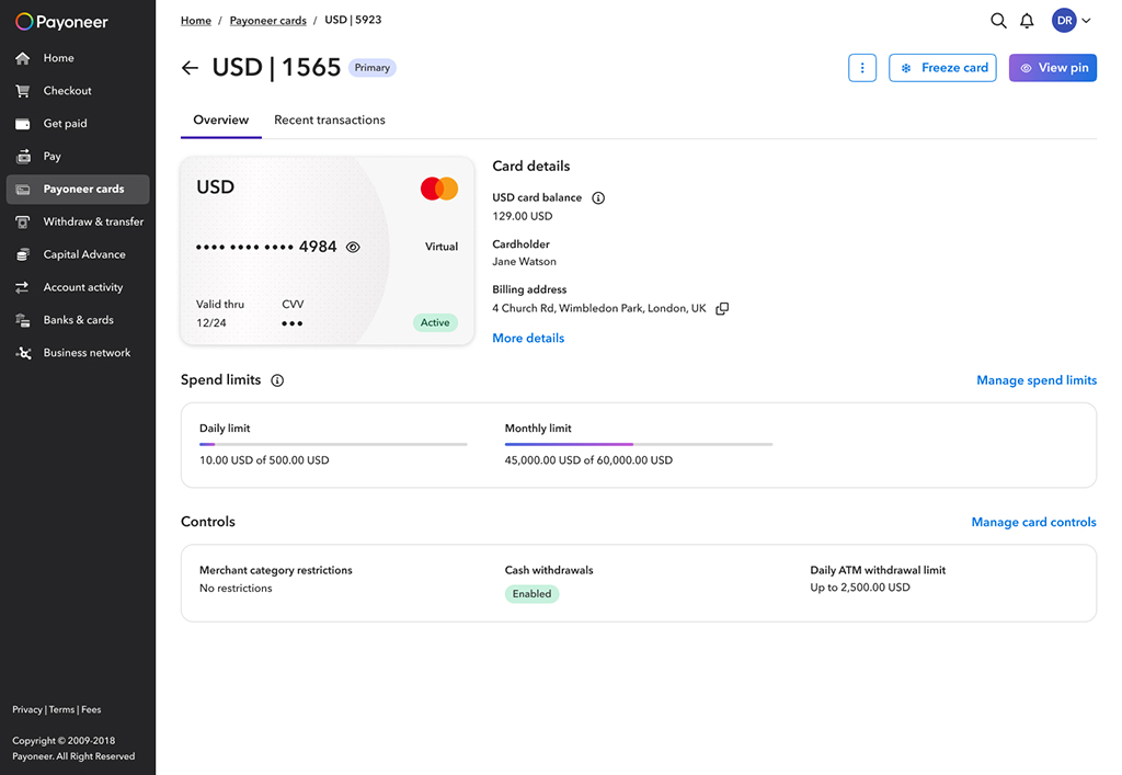
Virtual card page.
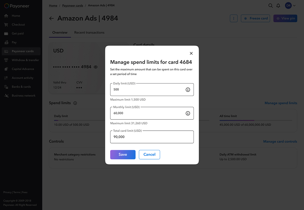
Virtual card page: Manage spending limit.
Impact
The new Cards page significantly improved user engagement, discoverability, and overall usability. With a 4.19% uplift in engagement and a 25.9% faster time to action, our customers are clearly finding it easier and more intuitive to manage their cards.
What We Tested
We compared the old Cards page with the newly redesigned version to evaluate how the new experience impacts user behavior.
Result: 📈 +4.19% uplift in engagement with card actions (e.g., view card number, view PIN, manage limits, freeze card)
Statistical Significance: 95%
Conclusion: The new design successfully encourages users to interact more with card features, validating our UX improvements.
Secondary Metric
⏱️ Discoverability → Median Time to Action
Result: ⬇️ 25.9% decrease in time to action
Statistical Significance: 95%
Conclusion: Users are finding what they need faster, showing a major boost in discoverability.
UX Survey Feedback
Post-launched surveys reveal that the new Cards page isn’t just easier to use – it’s exceeding expectations across the board. By following our UX health metrics, we saw significantly higher ratings (on a scale from 1 to 5) in key areas that reflect both functional clarity and emotional confidence.